PARENTS CONNECT RESOURCE PORTAL
.jpg)
DESIGN PROSE
Organization: Rose of Sharon Services For Young Mothers
Mediums: Adobe XD, Photoshop, Canva
Styles & Techniques: Web Design, UI Design, Interactive Design, Responsive Design
During Parents Connect's initial testing session, users were critical of the page's unappealing colour scheme of white, burgundy, and navy blue; unrealistic images of young parents and their babies; and the bland and amateurish overall layout. I was assigned to redesign and create interactive mockups for the final version of Parents Connect: Rose of Sharon’s new Resource Portal site. Responsibilities included creating an on-brand yet fresh and appealing colour scheme, selecting appropriate fonts, and choosing photographs that more accurately depicted young parenthood.
I created the main flyer for Parents Connect, which was used for both print and digital publications, as well as the first draft of the Parents Connect brochure. Additionally, I developed branding guidelines (linked below) for future reference by the Rose of Sharon personnel.
*Files available upon request.

Parents Connect Logo (Revised Colour Scheme)
SHORTCUTS
COLOUR SCHEME
The primary demographics of Rose of Sharon have expanded over the years. Initially created for young mothers aged 14 to 29, the organization now also provides services to young fathers, non-binary parents, and guardians as well. Considering this, at the time of Parents Connect's development, Rose of Sharon was considering making changes to its company colours to create a more gender-neutral brand image.
This new colour scheme would also reflect the brightly-colored toys often designed for young children, aligning with the site's child-focused atmosphere. The updated colour scheme was set to be introduced with Parents Connect's launch. As shown here, I utilized this colour scheme in Rose of Sharon's 2022 annual report, fulfilling the organization's goal to eventually incorporate it into all their materials.
.png)
.png)
.png)
MAIN PAGE SLIDES
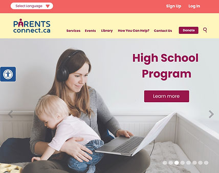
The photographs used in Parents Connect's first iteration received the most criticism, specifically for only portraying smiling parents playing or cuddling with their children. Not only were these depictions of parenting deemed unrealistic, but these photographs were also near-identical to each other and not truly representative of the programs that they were associated with.
While assembling my mockups, I actively searched for photographs that captured parents in action, such as a young mother attending school online with her baby girl on her lap, or a group of expectant mothers engaged in a discussion during a group session. My search also focused on finding photographs containing more diversity, bright, child-friendly colors, and ample blank space with enough room for the logo and/or program name, as well as a "Learn more" button.
.jpg)
.jpg)
.jpg)

.jpg)
.jpg)
.jpg)
.jpg)
PROGRAM PAGES
The original site's inner pages had significant issues, including a lack of photographs, overly cropped banner images, and poorly formatted text with extensive paragraphs. The titles, in particular, were difficult to read due to poor contrast.
In the revised site, visitors are greeted with large, vibrant photographs that provide an inviting introduction to each program. The brightness of these images ensures that logos, names, and brief descriptions are easily visible within each header. To enhance this visibility, I added gradient feather effects, which also contribute to a softer overall appearance for each page.
Additionally, I improved the format of the inner pages for better readability. Bolded labels were included, along with appropriate spacing and the use of bullet points to separate paragraphs.


The "Did You Know" section at the beginning of each page serves a crucial purpose in drawing people in to learn more about these programs.
Finding suitable spots to add additional photographs was relatively easy. Both an introductory photo and a "Contact Information" photo were seamlessly integrated into each page. These images aim to provide further insight into what each program is like. A notable example can be found on the High School Program page, where the photos showcase the specialized classroom environment, students completing schoolwork while expecting, and attending the York Academy's online school.


SERVICES
I was asked to create mockups for the main "Services" page of Parents Connect. As an example of the format for the inner pages, I also worked on the "Search By Postal Code" page. To enhance the theme, I thought it was important to use a relevant parenting-themed photograph for each of these "Search" pages. Since the postal code reflects a person's street address, I chose a photograph of a mother taking her baby for a walk around the block.


FLYER

When creating the 2021-2022 Annual Report, we also needed a flyer to effectively promote Parents Connect. Two key aspects were considered essential for the layout: reflecting the website's features and appealing to the mother-child demographic.
Included in the flyer’s final layout were small informational blurbs with accompanying images of the portal's main page, inner pages, and features. To create a childlike atmosphere, we used paint blobs filled with the main colours of the Parents Connect logo. These also served as suitable frames for the images.
This design was ultimately adopted as the official flyer for Parents Connect and was used for full-page newspaper ads, as well as the front page of its brochure.
BROCHURE
Although my contract with Rose of Sharon ended before I could contribute to the final product, I was asked to create a quick draft of the Parents Connect brochure. I requested to use Canva for this task, which would allow my colleagues to easily edit the brochure template for subsequent drafts. Additionally, I was instructed to incorporate much of the formatting from the 2021-2022 Annual Report to ensure brand consistency, including using the same colour scheme. The cover of the brochure would reuse the main flyer from Parents Connect, while the back cover would be identical to that of the Annual Report, both resized and reformatted as necessary to fit the narrower page dimensions.

I aimed to include as many photographs as possible in the brochure's inner pages, which would expand on Rose of Sharon’s outreach programs. I selected the appropriate page for each photograph based on the programs described on those pages. For example, the first page featured the York Academy, Group Programs, and Child Development Centre; accordingly, the photos for these sections on the Parents Connect site would be used throughout the page. Reusing these images would also enhance the consistency and familiarity of Parents Connect's promotional materials.
Additionally, the sharp frame shapes used align with how photos are presented on ParentsConnect.ca and can be easily incorporated into the header and footer areas. However, I had to be more creative with the second "Outreach Programs" page, as I needed to include four photos to showcase one of Rose of Sharon's newer initiatives: Dad Talk. To accommodate this, I created a specialized text box to introduce Dad Talk, allowing space for a small, cropped version of the Dad Talk slide photograph from the main page.
Considering the brief descriptions of Parents Connect's features on the front cover, the introductory paragraph on the first page, and the small blurbs and photographs included on both Outreach Programs pages, readers will receive a comprehensive preview and introduction to ParentsConnect.ca overall.

